|
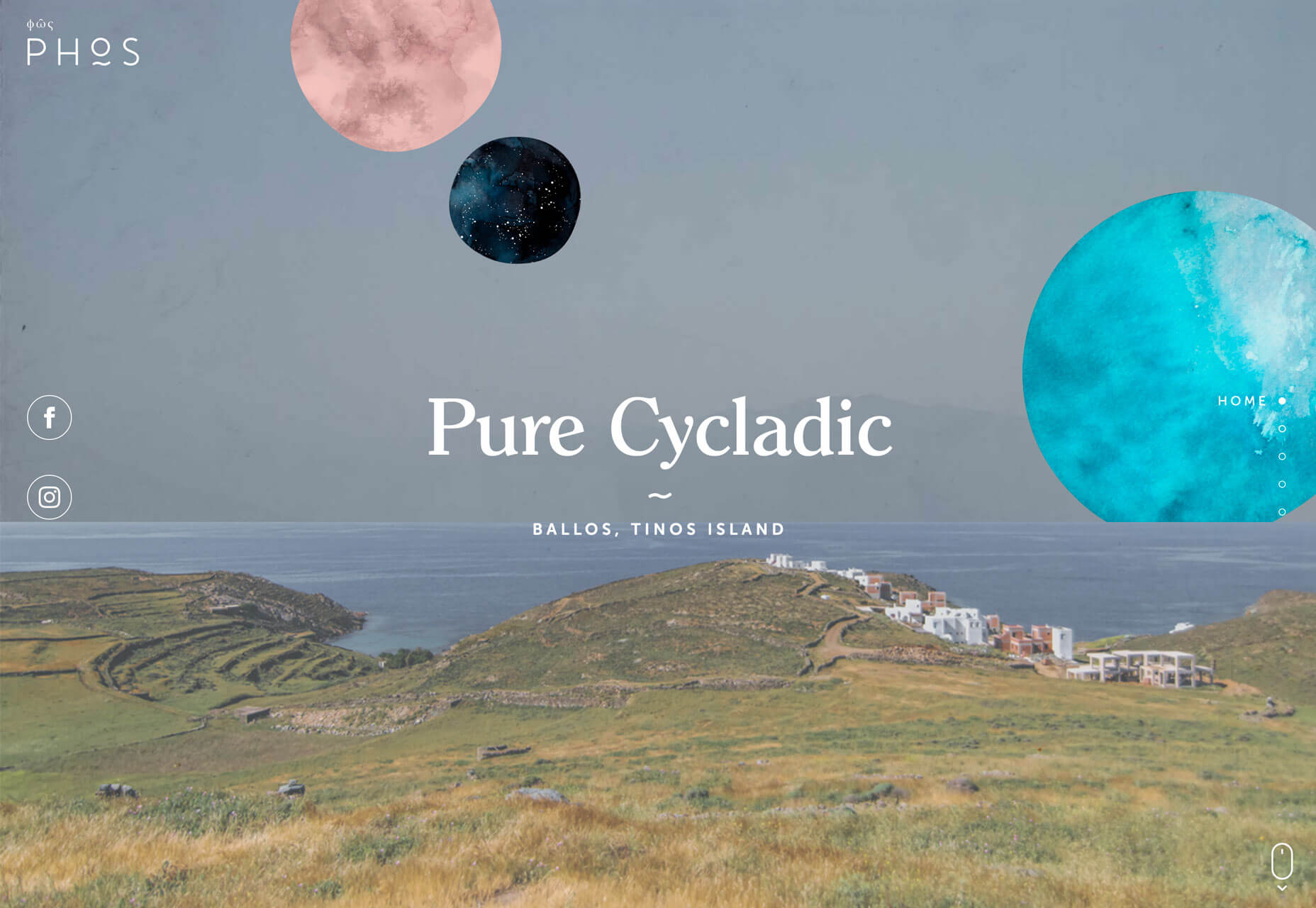
This type of trend is interested because designers either love them or hate them. Take a look and see if these are concepts you’ll use. Here’s what’s trending in design this month. Exaggerated White SpaceSo much white space. These websites feature exaggerated amounts of whitespace and strong minimal themes with very little color or design ornamentation. And if you are like me, you can’t stop looking at them. How does a design with so little visual information work? The design trick here is disruption. If you see one of these designs, they are vastly different than almost any other site you are visiting. That makes you stop, and look, and think about what you are seeing. With the right content it can be quite effective. While each of the designs here use exaggerated amounts of white space and practically no color, they don’t all look the same and use complementary effects to get a message across. VS+Company uses a subtle animation with text blocks that appear next to the oversized “POST” and “MGMT” lines. The text provides additional content and information about the website and uses a black color that makes it easy to read.
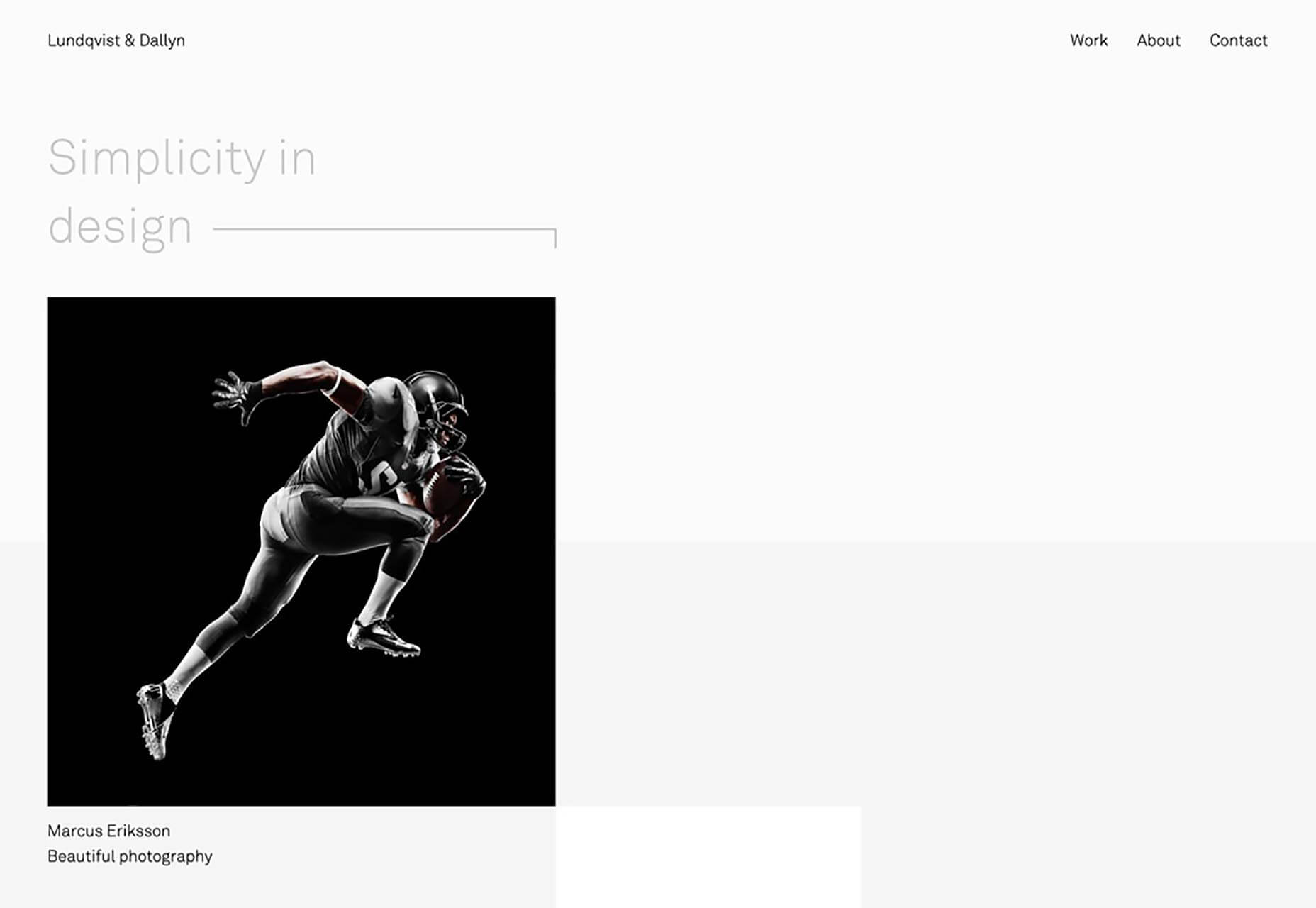
Lundqvist & Dallyn asks a question to pique user interest. The image on the home screen and throughout the scroll feature hover animations that encourage clicks.
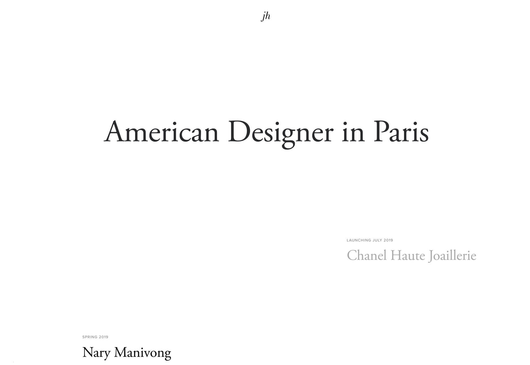
Jillian Hobbs uses white space to help users hone in on the words – in this case project names – to interact with. It’s a risky concept for a design portfolio, but it did encourage clicking through to pages with the same visual pattern, but featuring images and color.
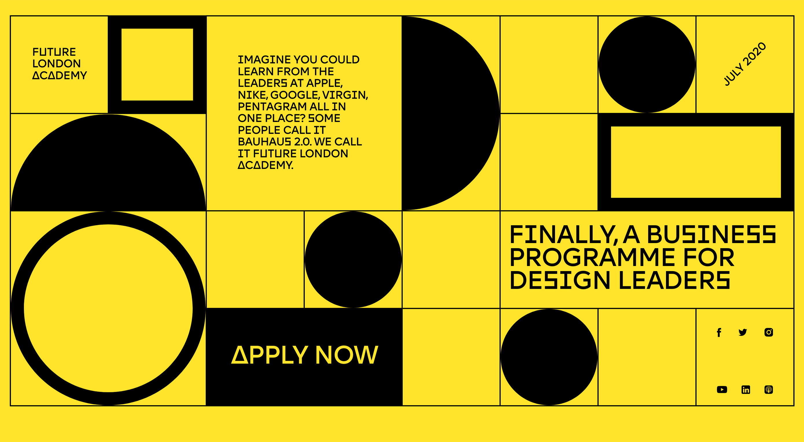
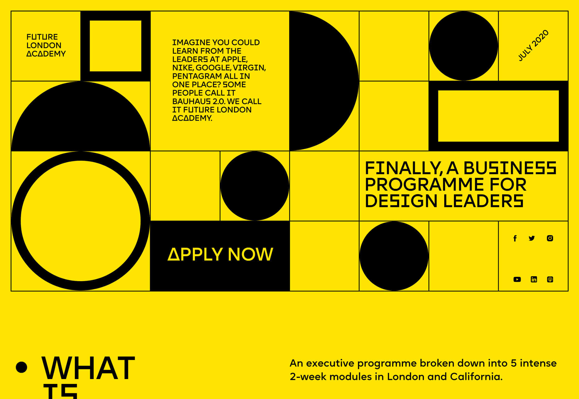
Sharp Edges and LinesWhile brutalism has never fully taken off as a widespread design trend, it is influencing designers. Sharp edges and lines are one way that we’re seeing it manifest. Most recently, projects have had a softer feel with gradient coloring, real images or illustrations, and softer shapes. The projects below feature more hard edges, thick lines and square shapes. These shapes can be paired with different elements to establish a feel. The result is a design trend that’s a little harder, stronger, and harsh. It almost demands that you look at it. Future London Academy uses bold yellow and black to create the most brutalist feel of the collection. Even the typography has an edge to it.
Purple Rock Scissors has an animated twitch to the hard lines on its homepage, which creates a feeling of unease for users. Why is everything twitching and moving in this way? It almost forces you to scroll. All of the video clips on the site use the same effect, which feels a lot like what we are seeing with the TikTok social network.
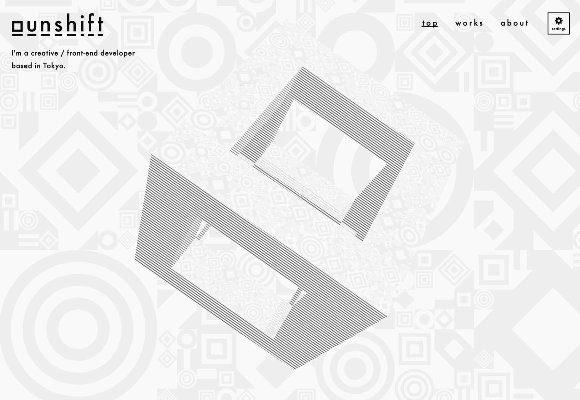
The Unshift portfolio focuses on shapes and animation with almost no color to draw users in. The moving cube is intriguing and enough to generate interest.
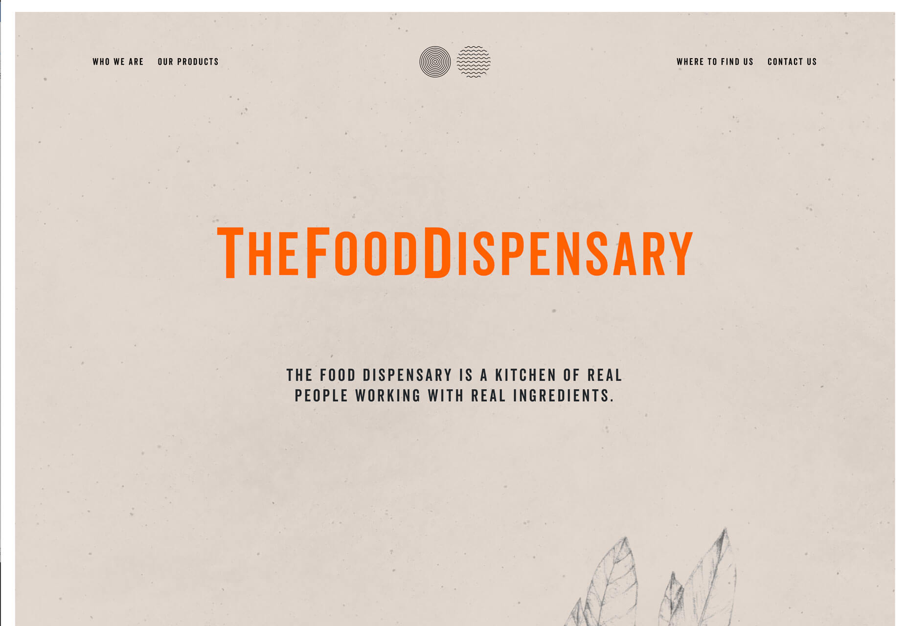
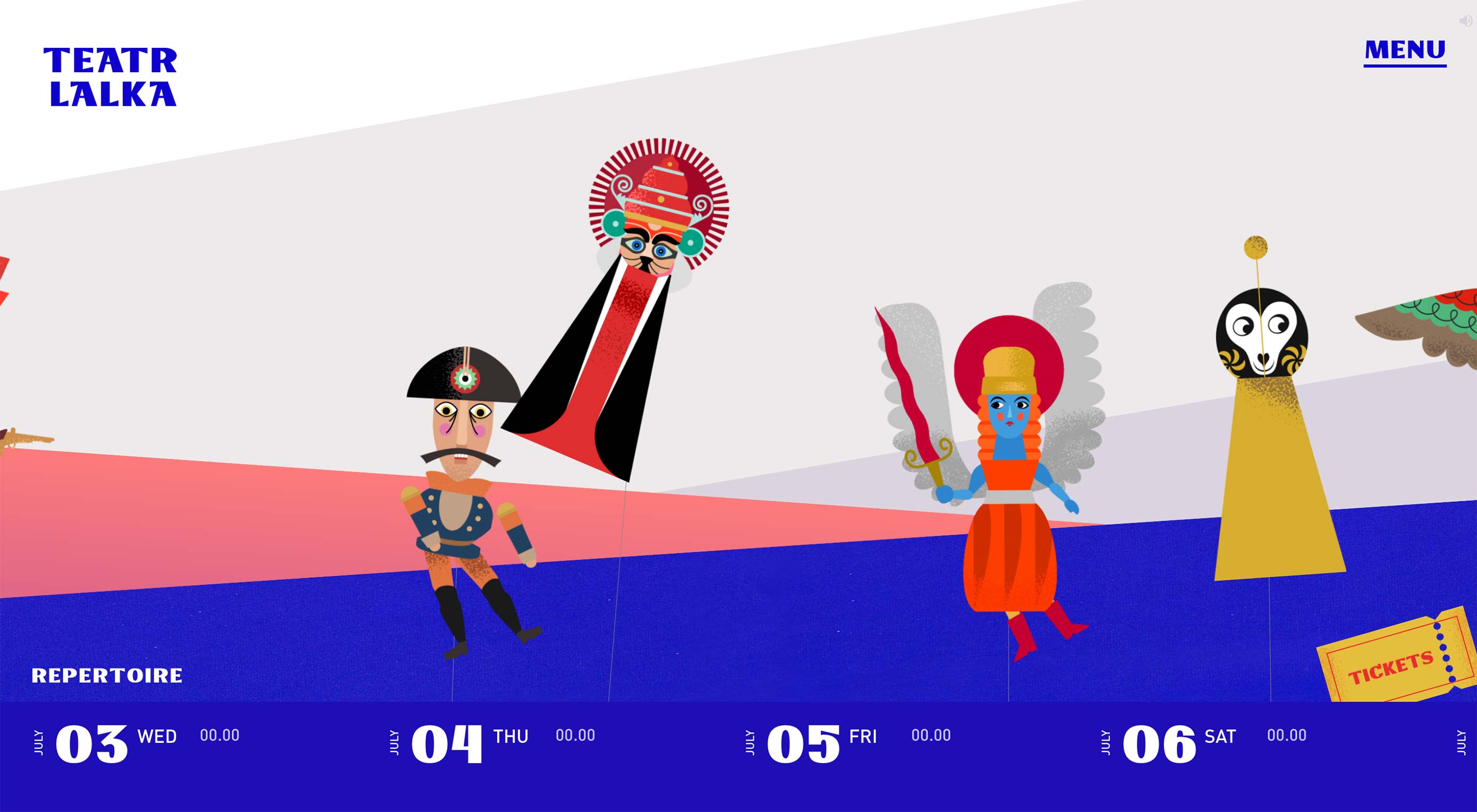
Screen-Centered HeadlinesHero headlines aren’t a new trend at all. But have you noticed a shift in the placements of the big text on homepages? It’s vertically and horizontally centered. The placement makes sense when you think about it. The eye will go right to the middle of the screen and then spread out to other elements. But do you love the super symmetrical feel? The other benefit to this design technique is for the mobile versions of websites. It fits just a nicely on a mobile screen as desktop. Conversely if the text is positioned strong to the left or right, it often has to be moved when you shift from a more horizontal to vertical screen orientation. This is one of those neat trends that’s heavily influenced by technology and how we use and interact with devices online. The only thing to be aware of with a trend like this is that while perfect symmetry is harmonious and visually appealing it might not work with all backgrounds or imagery. It can also start to seem somewhat boring if everyone does it. Finally, think about the length of words and messaging. With too many characters this style can feel heavy and overwhelming and works best with short blocks of text, such as each of the featured examples below.
ConclusionWhen it comes to over-the-top design ideas, what works for you, do you prefer color, space, or typography? While you can see some influences of these trends on each other, what makes them work is that the focus is on one strong design element. Love these ideas or hate them, each project above has a design style that encourages users to take a second look and consider engaging with the design. from Webdesigner Depot https://www.webdesignerdepot.com/2019/07/3-essential-design-trends-august-2019/ 3 Essential Design Trends, August 2019 See more on: The Instant Web Site Tools Blog from https://www.instant-web-site-tools.com/2019/07/29/3-essential-design-trends-august-2019/
0 Comments
You’ve designed a brochure. Now what? With so many printing options out there, how do you know what option is best? The decision can depend on budget, paper, and printing needs, turnaround time, as well as other factors. And not all print options are created equal. Today, we’re going to compare three different option for printing a brochure so that your design can shine on paper. Make sure to click through the examples as well, for some more images of beautifully printed brochures! Or, browse through our complete guide on how to design a brochure.
1. Use a Local Printer
A local printer or print shop can provide a lot of brochure needs and help you get a feel for what the final product will look like ahead of printing.
Local printers often offer quick turnarounds since you won’t have to wait for shipping as well.
Most local printers have paper — in different stocks and colors — on hand so you can see what options are available and pick the paper that’s right for the job. (Nice paper stock can really impress certain audiences and make your design that much more memorable.) Local printers often offer quick turnarounds since you won’t have to wait for shipping as well. Look for a print shop in your region or ask for a recommended printer from industry peers. Different local printers might have specific things they do exceptionally well. Local printers are a great option for small jobs as well. Many online printers have minimum quantities that aren’t a restriction when you work locally. Finding someone in your region that can print brochures for you is the recommended option. The service will be hard to beat and it’s always a good idea to do business within your community. Pros
Cons
2. Use an Online Printer
One of the most popular options when it comes to brochure printing is to use an online printer. There are tons of options available with printers who specialize in scaled-up jobs.
The primary benefit of online printing is the ability to produce large print jobs without a lot of additional cost.
Online printing is design for when you need a job with scale, aren’t in a hurry, and don’t need a lot of fancy options (even though you can get somewhat fancy). The primary benefit of online printing is the ability to produce large print jobs without a lot of additional cost. If you’ve ever ordered brochures from an online printer, you might have noticed that the cost of printing 500 and 1,000 only changes the price by a few dollars. The biggest challenge with online printers is proofing. If you have a specialty job, getting a printed proof is more difficult and costly from a vendor that isn’t physically located nearby. Pros
Cons
3. Do It Yourself

The final option for printing a brochure is to do it yourself. (We aren’t showing self-printed examples above.)
The biggest challenge with a DIY job, is getting creating a design that will still look good without professional printing.
DIY printing isn’t generally recommended unless you have a high-quality printer and only need a few copies. It can also be a challenge to get the folds exactly right for brochures (such as a tri-fold), resulting in a sloppy final product. But it is an option if you have a simple job without a bleed. The biggest challenge with a DIY job is getting creating a design that will still look good without professional printing. It’s very difficult and depends on the type of brochure you are producing. Most people don’t have the tools to properly fold DIY jobs or bind multi-page brochures properly. For most designers, the only reason to go the DIY route is to create a mock proof to preview the design in person. Clients will often ask for a design that can be printed in-house and helping them understand the challenges of a good print is important; you should also shift the design strategy accordingly if DIY printing is the choice. Pros
Cons
ConclusionSome designers are opting not to print brochures at all and go paperless. This option can be viable as well as long as you have a way to get the digital brochure design in front of the right audience. For most designers, paperless works best in concert with a printed brochure. It’s always OK to mix and match options for the solution that works best for your job. from Design Shack https://designshack.net/articles/graphics/how-to-print-a-brochure/ How to Print a Brochure: 3 Options Compared is republished from Instant Web Site Tools from https://www.instant-web-site-tools.com/2019/07/29/how-to-print-a-brochure-3-options-compared/ How many times have you walked away from a great presentation and wished you had the notes from the slide deck? Or are you a presenter that wants to provide slides and notes in a handout format for the audience or for you to uses as a reference while speaking? Printing a PowerPoint presentation with notes attached can be a valuable tool for presenters at all levels. You can physically print and distribute presentations with notes or “print” them to a PDF for easy digital sharing. Here’s how you do it.
Create Notes in Your PowerPoint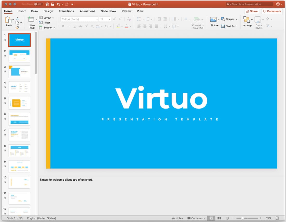 The first step toward printing notes from a PowerPoint presentation is to include notes in the proper location.
Don’t put anything in the notes that should not be public information.
Open your file and click the Notes button in the bottom toolbar to show the notes field if it is not open. Then just type your notes in the area provided. Click and drag the line above the notes area to expand or collapse the amount of space available. If you plan to print notes and hand them out, take care with the information you type in. Make sure to use proper spelling, grammar, and citations. Don’t put anything in the notes that should not be public information. You can use formatting in the notes area, just like any other part of the slide. This includes bulleted and numbered lists or formatting such as bold or italics. Save your presentation before printing. Print the Presentation with NotesThere are two view options for printing PowerPoint presentations with notes:
Once you know what format you want to use and your presentation is ready, go to the File tab and click Print. 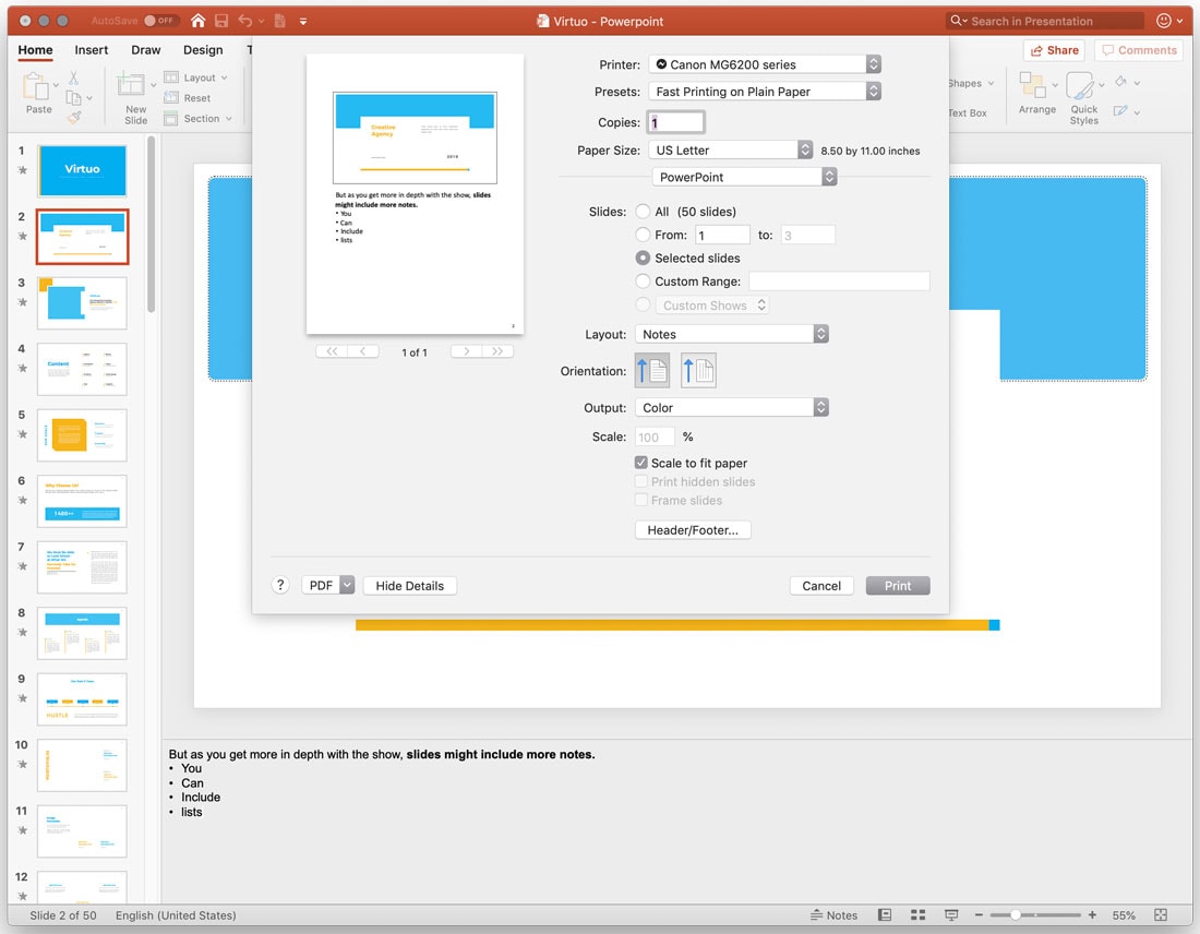 To print a PowerPoint presentation with your speaker notes, change the layout to Notes. This option prints one slide per page with notes below it. Set other options, such as number of copies and select color or black and white printing. Then click Print. 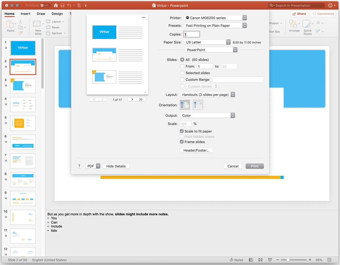 To print a PowerPoint presentation with room to write notes, change the layout to Handouts. You can select 2, 3, 4, 6, or 9 slides per page. The 3-slides-per-page format is most commonly used because it presents slides that are large enough to see with a lined space for note-taking. Then click Print. Print PowerPoint Notes Only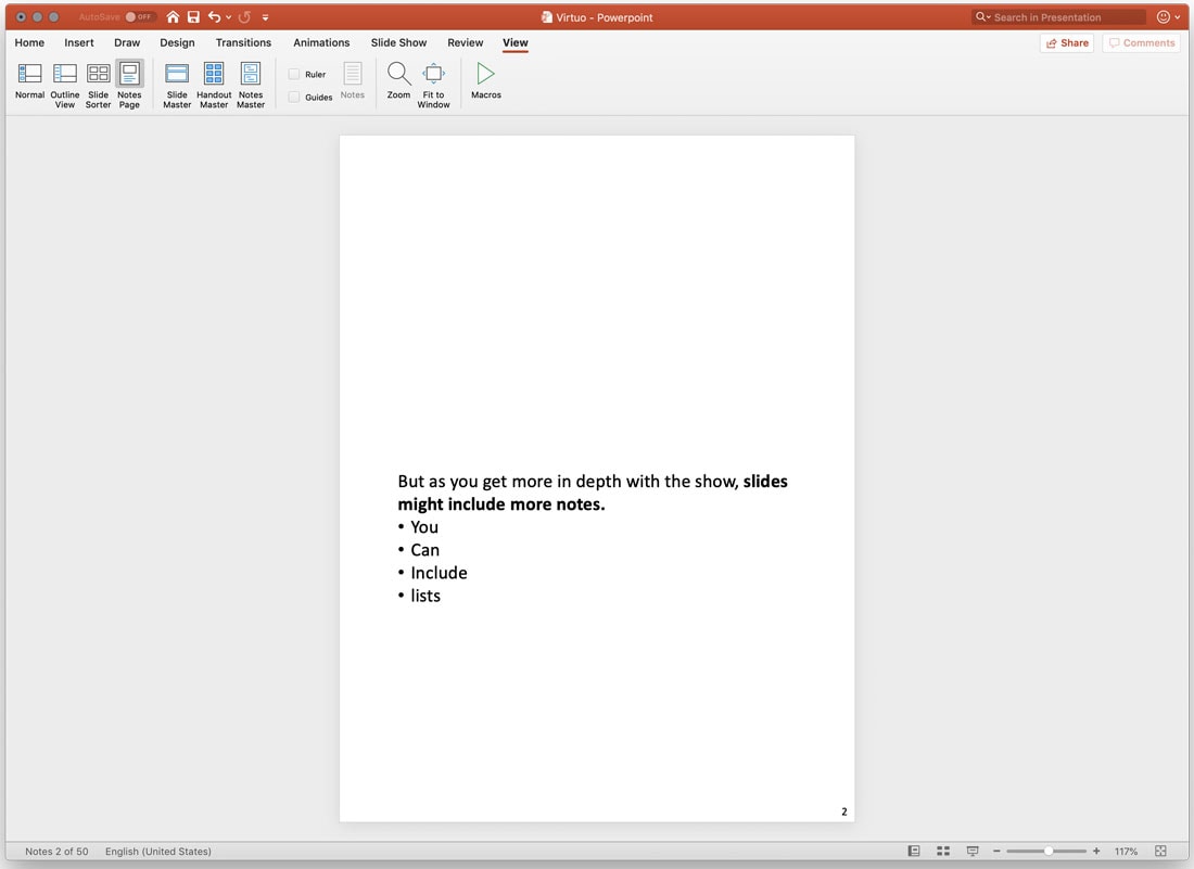 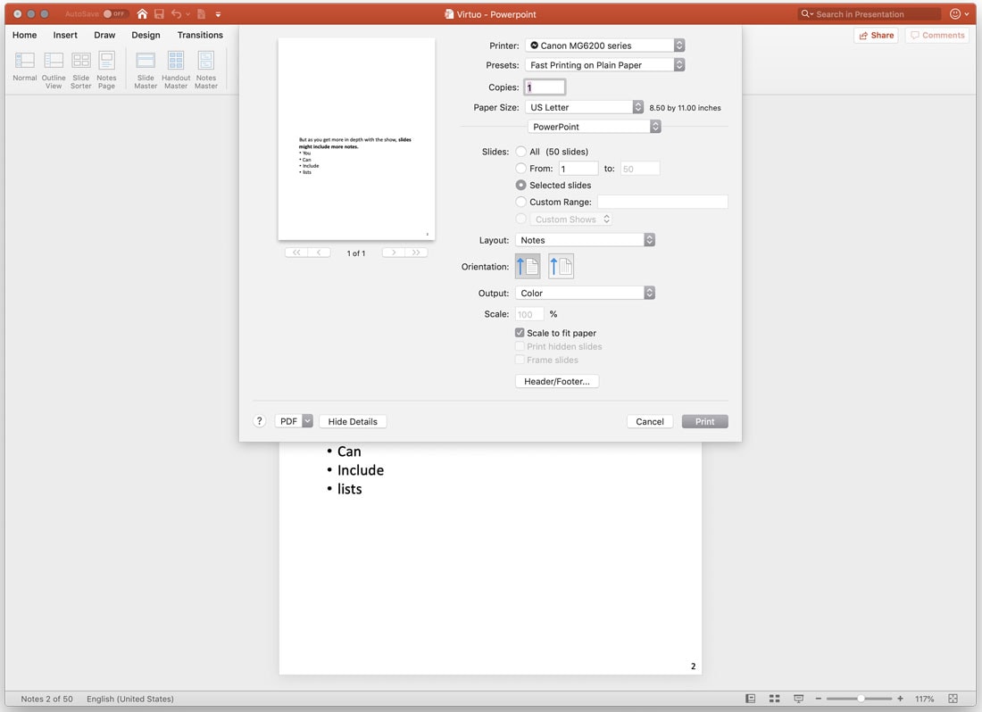 You can change the way notes print and remove the default print setting which includes the slide above notes, in the View menu. Navigate to view and click Notes Page. You can then delete the slide image or make any other design adjustments you want. You have to do this for each slide. If you want to change the notes design for all slides, make changes in the Notes Master. Then save and follow print using the Notes layout. ”Print” PowerPoint Presentation to PDF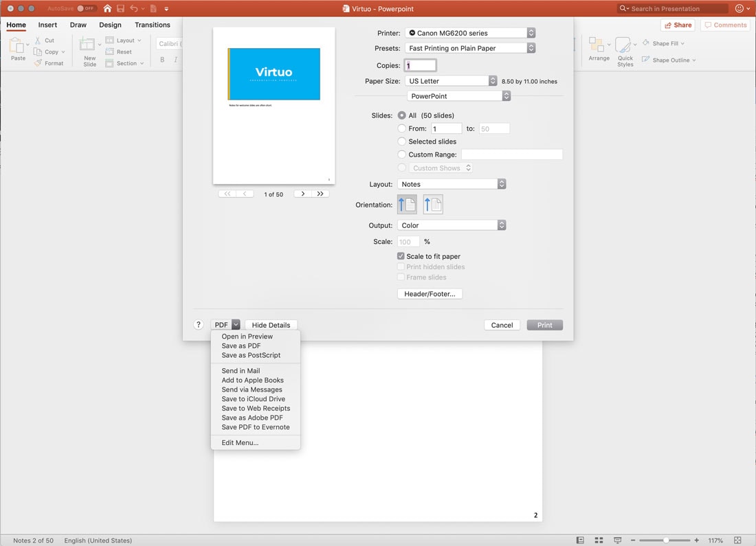 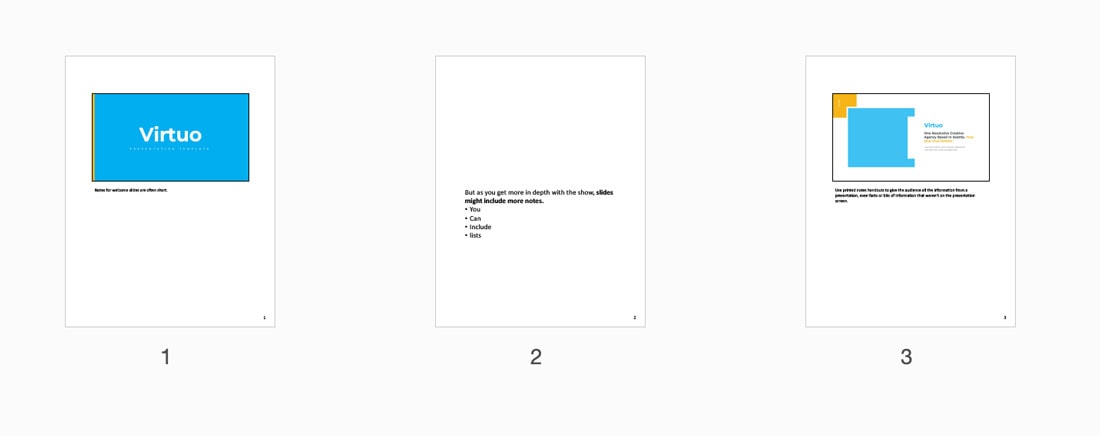 Rather than printing a PowerPoint on paper, you can “print” or save the notes as a PDF. Go to the File tab and click Print. Choose your layout (Notes or Handouts). Select Save as PDF. ConclusionThat’s it. Now you have all the tools you need to print a PowerPoint presentation with notes. Don’t forget to take a look at our full PowerPoint templates guide, or our collection of the best PowerPoint templates for your next project! from Design Shack https://designshack.net/articles/software/how-to-print-a-powerpoint-presentation-with-notes/ The blog post How to Print a PowerPoint Presentation With Notes Find more on: The Instant Web Site Tools Blog from https://www.instant-web-site-tools.com/2019/07/28/how-to-print-a-powerpoint-presentation-with-notes/
The best way to keep track of all the great stories and news being posted is simply to check out the Webdesigner News site, however, in case you missed some here’s a quick and useful compilation of the most popular designer news that we curated from the past week. Note that this is only a very small selection of the links that were posted, so don’t miss out and subscribe to our newsletter and follow the site daily for all the news. Top 19 Web Design Trends for 2019
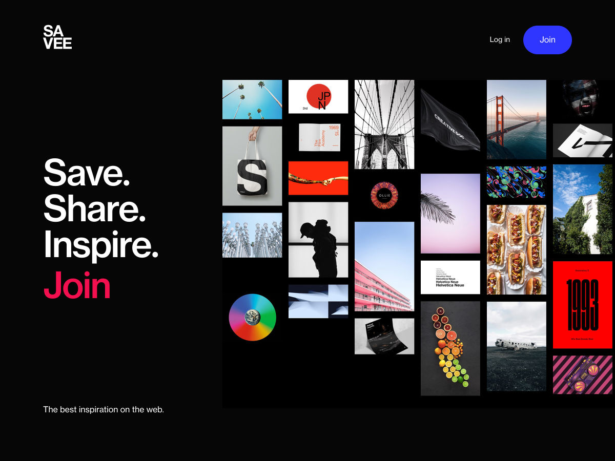
Savee.it
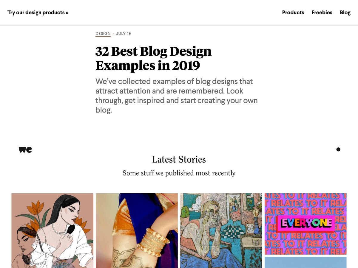
32 Best Blog Design Examples in 2019
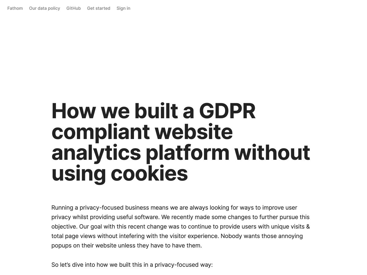
We Built a GDPR Compliant Website Analytics Platform Without Using Cookies
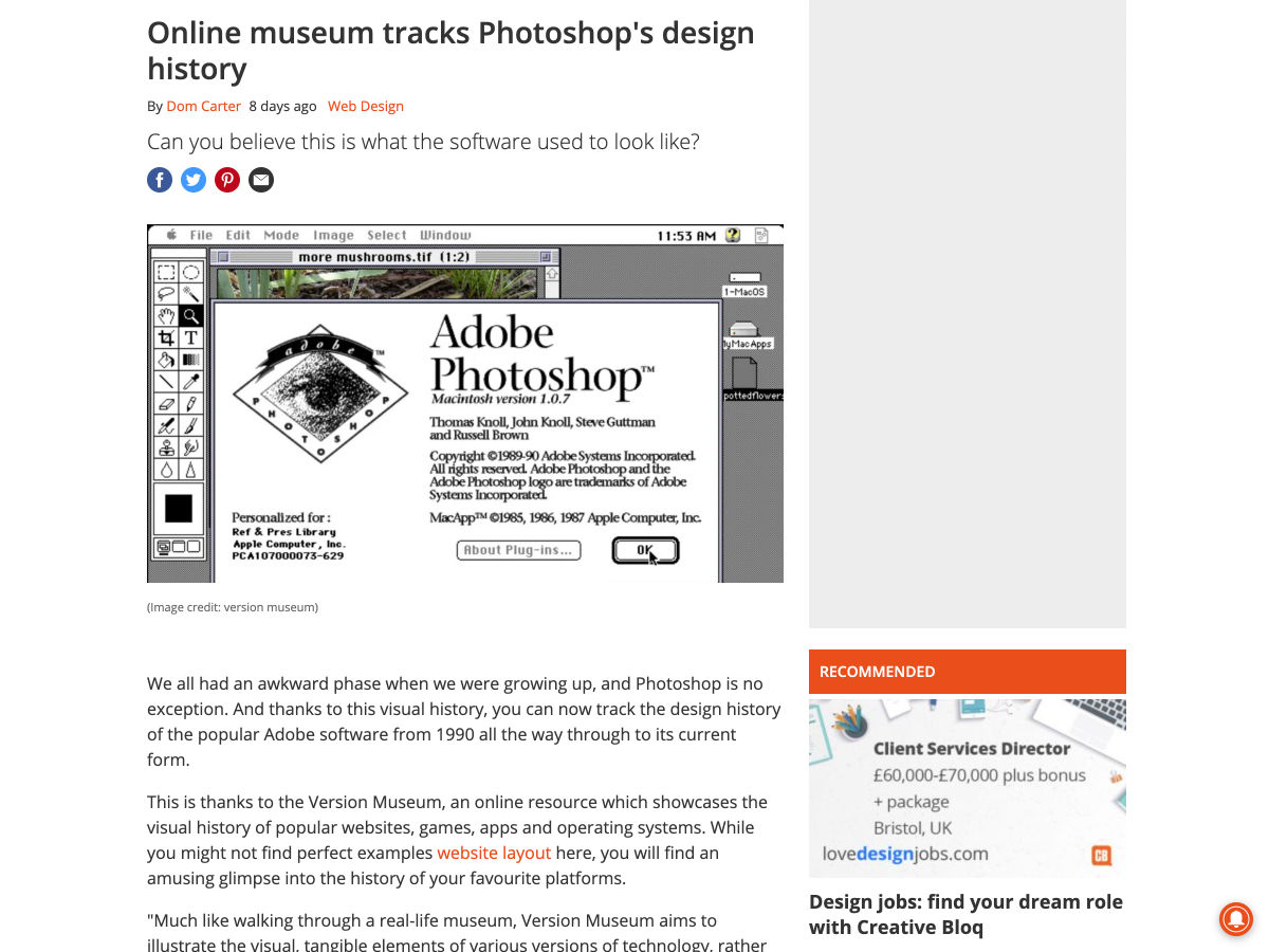
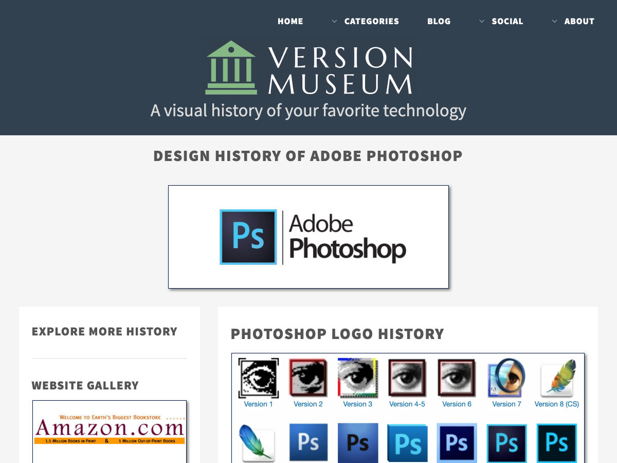
Online Museum Tracks Photoshop’s Design History
The History of Web Design
How to Build a Vue Front End for a Headless CMS
4 Do’s, and 4 Don’ts of Making a Graphic Design Portfolio
The Beginner’s Guide to CSS
Inspiring UX Designer Portfolio Examples
Output: HTML’s Native Live Region Element
11 Tips for Presenting your UI/UX Designs to Non-designers
Narrowr – Share Just One Link Per Day
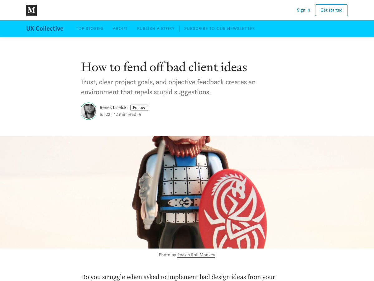
How to Fend Off Bad Client Ideas
Site Design: Zinacor
Airlines are Finally Fixing the Middle Seat
How to Find or Create your Brand Personality
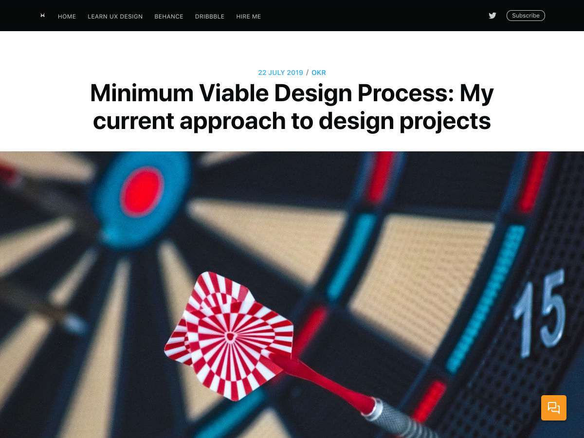
Minimum Viable Design Process
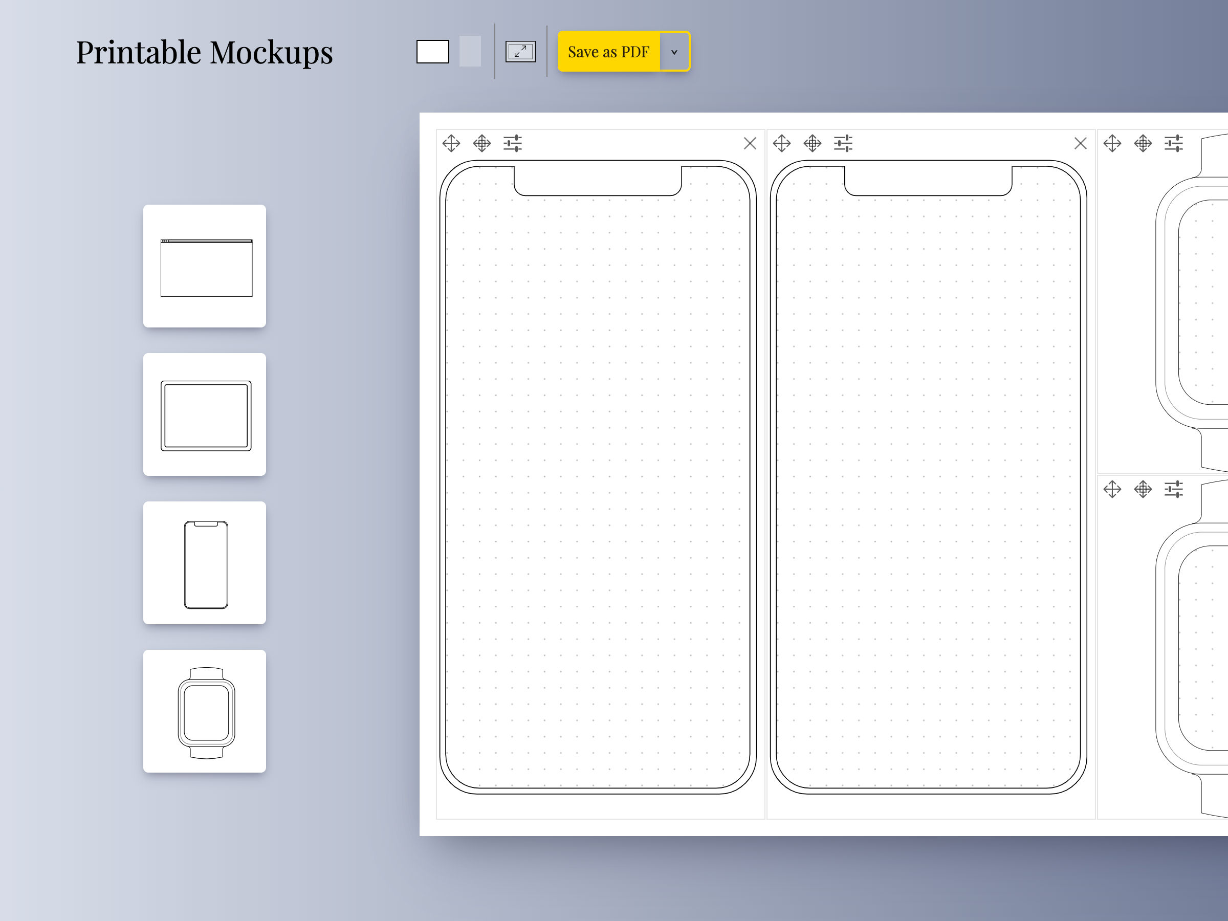
A Tool to Create Printable UI Mockups and Wireframes Templates
29 Years of Adobe Photoshop Design History
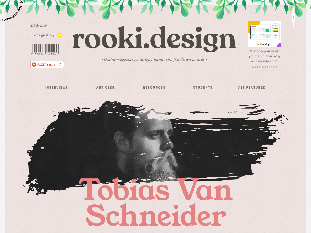
Rooki.design – The Online Magazine for Design Students
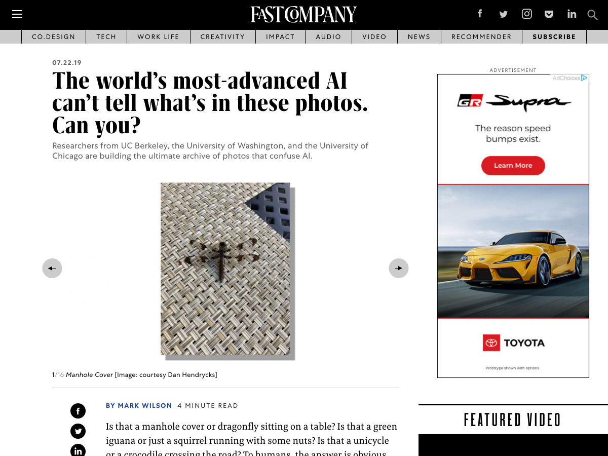
The World’s Most-advanced AI Can’t Tell What’s in these Photos. Can You?
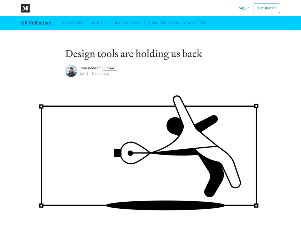
Design Tools are Holding Us Back
How to Test UX Design Early on in your Process
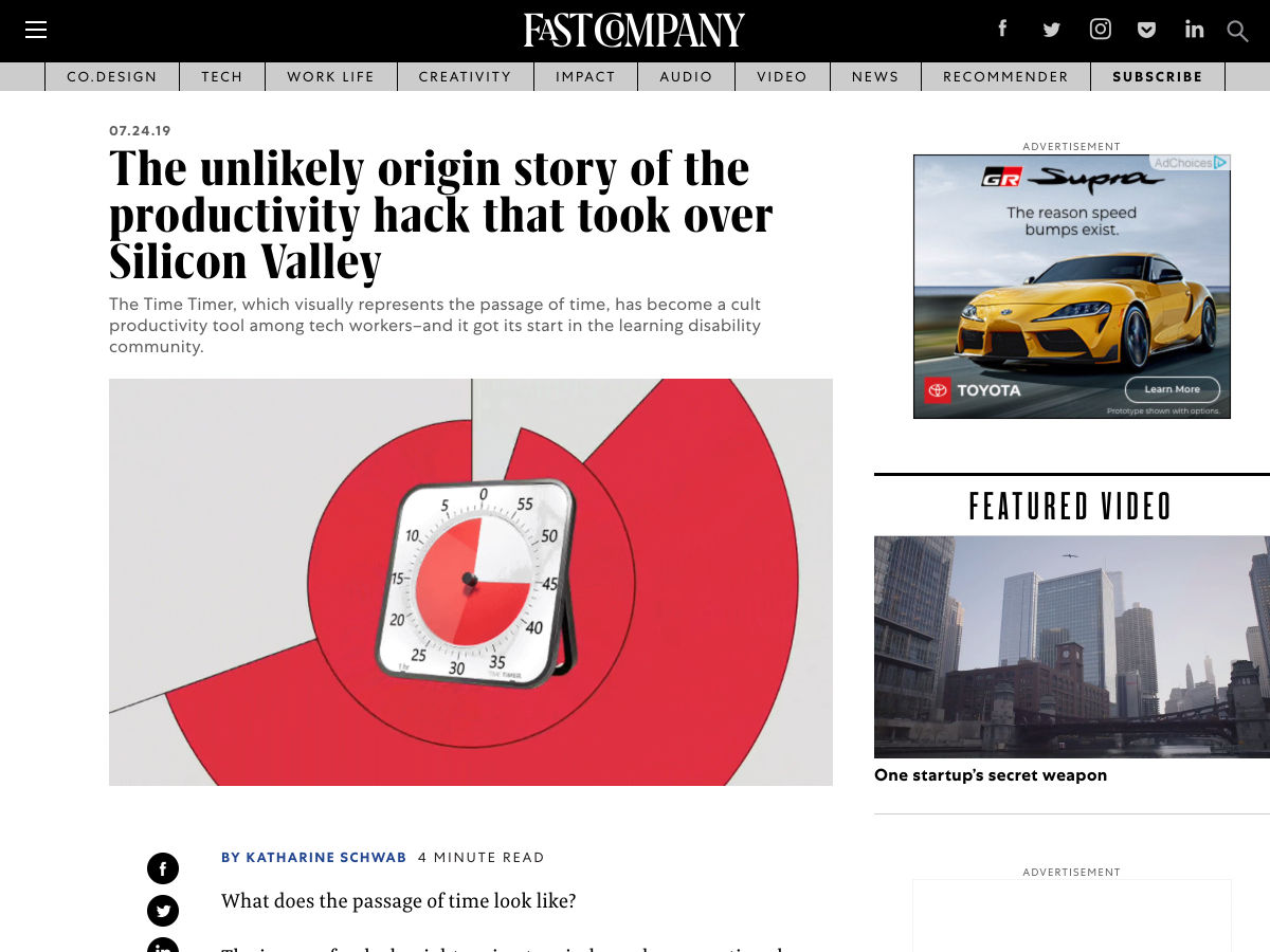
The Unlikely Origin Story of the Productivity Hack that Took Over Silicon Valley
Want more? No problem! Keep track of top design news from around the web with Webdesigner News. from Webdesigner Depot https://www.webdesignerdepot.com/2019/07/popular-design-news-of-the-week-july-22-2019-july-28-2019/ The following blog post Popular Design News of the Week: July 22, 2019 – July 28, 2019 was originally seen on http://www.instant-web-site-tools/ from https://www.instant-web-site-tools.com/2019/07/28/popular-design-news-of-the-week-july-22-2019-july-28-2019/ Be honest. Is your small business prepared for any kind of disaster? If it’s not, then it’s going to be very hard to sustain your business in the long run. As it is, it’s hard enough to sustain business in normal circumstances. What more in an emergency? Have you really thought about how your business can still run in an emergency situation? Or is closure your only option in such a desperate situation? When it comes to running a business, the only desperate situation that requires closure is the end of the world or a major natural disaster. Now, if you have backups, your business could still survive a natural disaster. It might take some time but there’s no doubt that your business can still run. After all, you have backups. What if, you don’t? The thought of backing up your business may not enter your mind at a time when everything is running smoothly. Well, that could get you in trouble. Just because everything is running smoothly doesn’t mean you don’t need to back up your business.
( Via: https://securityboulevard.com/2019/04/the-4-deadly-technology-sins-of-a-small-business/) Your business is not prepared for any kind of disaster if it’s not backed up. You cannot totally rely on the IT structure of your business to protect your data. That’s not enough.
What your business needs is a sound IT strategy.
( Via: https://securityboulevard.com/2019/04/the-4-deadly-technology-sins-of-a-small-business/) There’s no doubt that a sound IT strategy factors in data protection. After all, your business can’t run without data. So, you really need to come up with a sound IT strategy for your business. If not, the consequences could be pretty costly.
( Via: https://securityboulevard.com/2019/04/the-4-deadly-technology-sins-of-a-small-business/) There’s just no way you can run your business without the critical data you’ve created and collected over the years. Hence, is the reason why data protection is critical. You can’t expect data protection from the various hardware devices you’ve invested in. Hardware devices, such as computers and external drives fail as well. They can’t protect your business data forever. Even if you do have a good IT system, it still cannot guarantee data protection. An IT system is bound to fail especially if it's not protected.
( Via: https://securityboulevard.com/2019/04/the-4-deadly-technology-sins-of-a-small-business/) A sound IT strategy not only includes a fool proof backup process. It also includes data recovery from the various hardware devices that make up the IT structure of your business.
( Via: https://securityboulevard.com/2019/04/the-4-deadly-technology-sins-of-a-small-business/) One good way to provide full coverage for the various hardware devices of your business is to seek professional help. That way, you’re sure to recover data from the IT structure of your business. While your backups can help restore critical data, you would still need to recover sensitive information that’s stored in your hardware devices. For that, you might want to consider professional https://www.harddrivefailurerecovery.net/hard-drive-failure-solutions/. Learn more about how a professional recovery service works to protect your business in case of a disaster. Is Your Small Business Prepared For A Disaster? is available on HDRA Blog from Hard Drive Recovery Associates - Feed Is Your Small Business Prepared For A Disaster? Find more on: https://www.instant-web-site-tools from https://www.instant-web-site-tools.com/2019/07/26/is-your-small-business-prepared-for-a-disaster/ Let me just frame this for you: we're going to take a piece of production UI from a Sketch file, break it down into pieces of information and then build it up into a story we tell our friends. Our friends might be hearing, or seeing, or touching the story so we are going to interpret and translate the same information for different people. We're going to interpret the colors and the typography and even the sizes, and express them in different ways. And we really want everyone to pay attention. This story mustn't be boring or frustrating; it's got to be easy to follow, understand and remember. And it's got to, got to, make sense, from beginning to end.
I've asked my colleague Katie to choose a component she has designed in Sketch. I'll go through and mark it up (we mainly use SCSS, Twig and Craft but the templating language is not very important), then she will respond briefly. Hopefully I'll get most of it right, and then one or two things wrong, so we can look at how things get lost during handoff. In white label or framework type front-end, the focus is on building pieces that are as flexible and adaptable as possible, as content and style-agnostic as possible (within the scope of the product), because you simply will never know where the code is going and for what, ultimately it is being used. But recently I moved to a web design agency, which has a complete inversion of this focus. It is particular. It is bespoke. It's all about really deeply engaging with the particular client you have and the particular clients they have, and designing something that suits them, as a tailor would. Working so closely with a graphic designer like Katie, with highly finished pixel-spaced UI, instead of directly from wireframes or stories is an adjustment and an education, but there are still lots of things I can bring to the table. Chiefly: document design. Document design, which admittedly is just the old semantic web with an accessibility hat on, is really looking at graphic design, engaging with it as a system of communication, and translating the underlying purpose of the colors/type/layout into an accessible, linearizable, and traversable DOM. It's HTML, kids. It's just HTML. You'd think we all knew it by now… but look around you. You'd be wrong! Katie has slung me a Sketch file chock full of artboards, and she's pretty great at writing out what she wants so I don't have to think too hard: 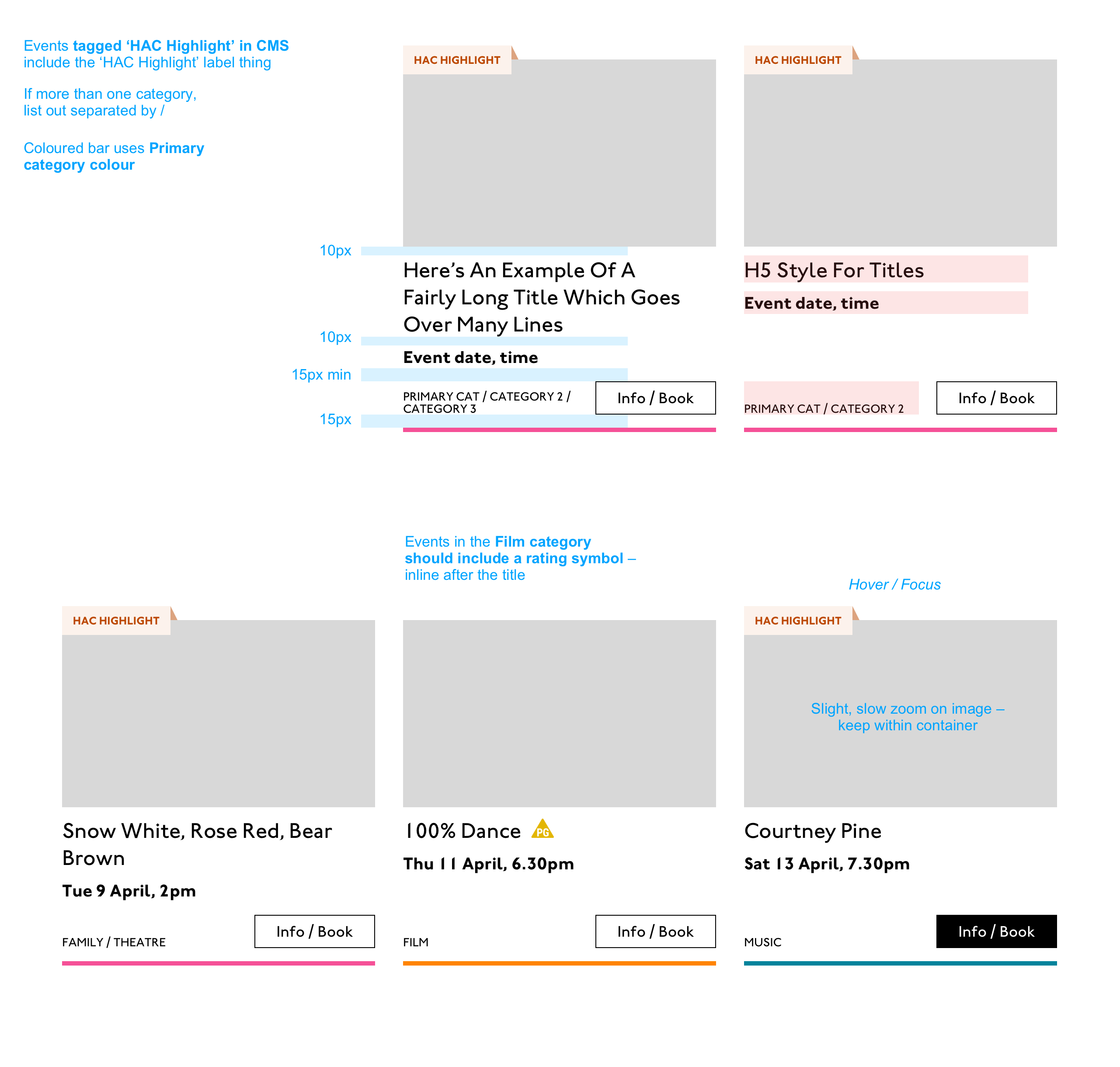
First I look through the whole UI file and figure out what is actually a card on this site — it turns out there are six or seven components that use this paradigm. Let's make some observations: 
So a card is the major way my user is going to find their way around this site. They are going to be clicking through guided pathways where they get a set of cards they can choose from, based on top pages like "what's on" or "classes." They're not getting options on this card. It's not really an interactive element — it's a guide, an index card, that sets her onto her path: in this case a purchase path where she books a ticket for a show at this arts centre. Before going on, let me just frame this for you: Imagine you were looking at a flyer for a show and discussing it on the phone. If you actually wanted to go to this show in real life. What would you do? You wouldn't just read the flyer out, would you? That's the text. And it might have all kinds of random stuff on it if you started literally at the top. You wouldn't start with "Twentieth Century Fox" or "Buy Hot Dog Get Cola Free" or "Comedy Drama Musical Family Friendly." (I would actually hang up on you if you did!) And you wouldn't simply describe the color or fonts. That's the CSS. You'd talk through the information on the flyer. You'd say, "It's The Greatest Showman and it's on Tuesday, starts at 7:30. It's at the Odeon on Oxford Street by the tram." Right? This is the document. Keep that person on the phone in your mind. Count, group, and nameSo let's say we'll deliver a card as the inside of a list item. We want a group and that group should be countable. We've already named the page with an
See the Pen AnchorIn this particular case, I'm gonna wrap this whole card in an anchor element ( Title
Then we'll jump down a heading level and mark up the name of each show as a heading, an Now let's deliver our metadata. Let's list it:
BadgeThis seems to be something the venue adds to a card to highlight it. As a developer, I can't immediately see why a user would look for this, but it's emphasized strongly by the designer, so I'll make sure it stays in. Katie has moved the badge up out of the flow, but I know that with a headings jump our user could miss it. So I'll just put the wording directly after the title, I think. I'll either put it first or last, so make it easier to account for in a non-visual browse and not be too crazy paving in a tabbing, visual browse.
...But on second thought, I won't put an
See the Pen
A quick aside: the 'badging' is very specific to this organisation. They want to show people clearly and quickly which events they've programmed themselves, and which are run by other organisations who've hired their venue.
Date/Time
Now date and time. Katie is keying me in to this decision point by styling the dates in bold. Dates are important. I'm going to pop it in an Categories/ Tags
Next come the categories, and I'm putting them after badge and date. This section is next in the visual order reading top-to-bottom, left-to-right, of course, but it also seems to be deprioritized: it's been pushed down on the left and the type is smaller. This works for our linear storytelling. As a rule, we don't want people to sit through repeated or more general content (cinema, cinema, cinema) to get to unique or more specific content (Monday, Tuesday, Wednesday). Remember, we are inside our card: we know it has already been sorted in a few general ways (news, show, class, etc), so it's likely to have a lot of repeated pieces. We want to ensure that the user will go from specific to general if we can. There is a primary category that is sorted first and then some other categories sometimes. I won't deliver this as a countable list as there's mostly just one category, and loads of lists of one item is not much use. But I will put a little tag beforehand because otherwise it's a slightly impenetrable announcement. MOVEMENT! SPOKEN WORD! (I mean, you can work it out retrospectively, but we always try to name things first and then show them, in linear order. This isn't Memento.) I used to use
Also I'm hard-coding in my spaces to make sure the categories never run together into complete garblage even with text compression or spaceless rendering turned on somewhere down the pipeline. (This can happen with screen readers and spans and it's rather alarming!) There's a piece of this design I will do in the CSS but haven't really pulled into the document design: the color coding on primary category. I am not describing the color to the reader as it seems arbitrary, not evocative. If there were some subtextual element to the color coding beyond tagging categories (if horticultural classes were green, say), then I might bring it through, but in this case it's a non-verbal key to a category, so we don't want it in our verbal key. I'm sorting the primary category to the front of the category paragraph, but I'm not labelling it as primary. This is because there's a sorting filter before this list that sorts on primary category, and it's my surmise that it would be easier and less annoying to select a category from that dropdown than to read through each card saying Categories Primary Category Music Secondary Categories Dance. I could be wrong about that! Striking a balance between useful and too much labelling is sometimes a bit tricky. You have to consider the page context. We may be building components but our user is on a page. See the Pen Action
Last, the action. The direction to the user, to Book, or Learn More, or whatever it is, has been styled as a button. It's not actually a button, it's just a direction, so I'll mark it up as a span in this case. I definitely want this to come last in the linear document. It's a call to action and also a signal that we've reached the end of this card. The action is the exit point in both cases: if the user acts, we go to the target entry; if they do not, we go to the next card. We definitely never want any data to come after the action, as they might have left by then. See the Pen My conclusionThis markup, which counts, groups, and names data, delivers linear and non-linear interactions. The page makes sense if you read it top to bottom, makes sense if you read parts of it out of context, and helps you jump around. Katie, over to you...
Katie Parry, designer
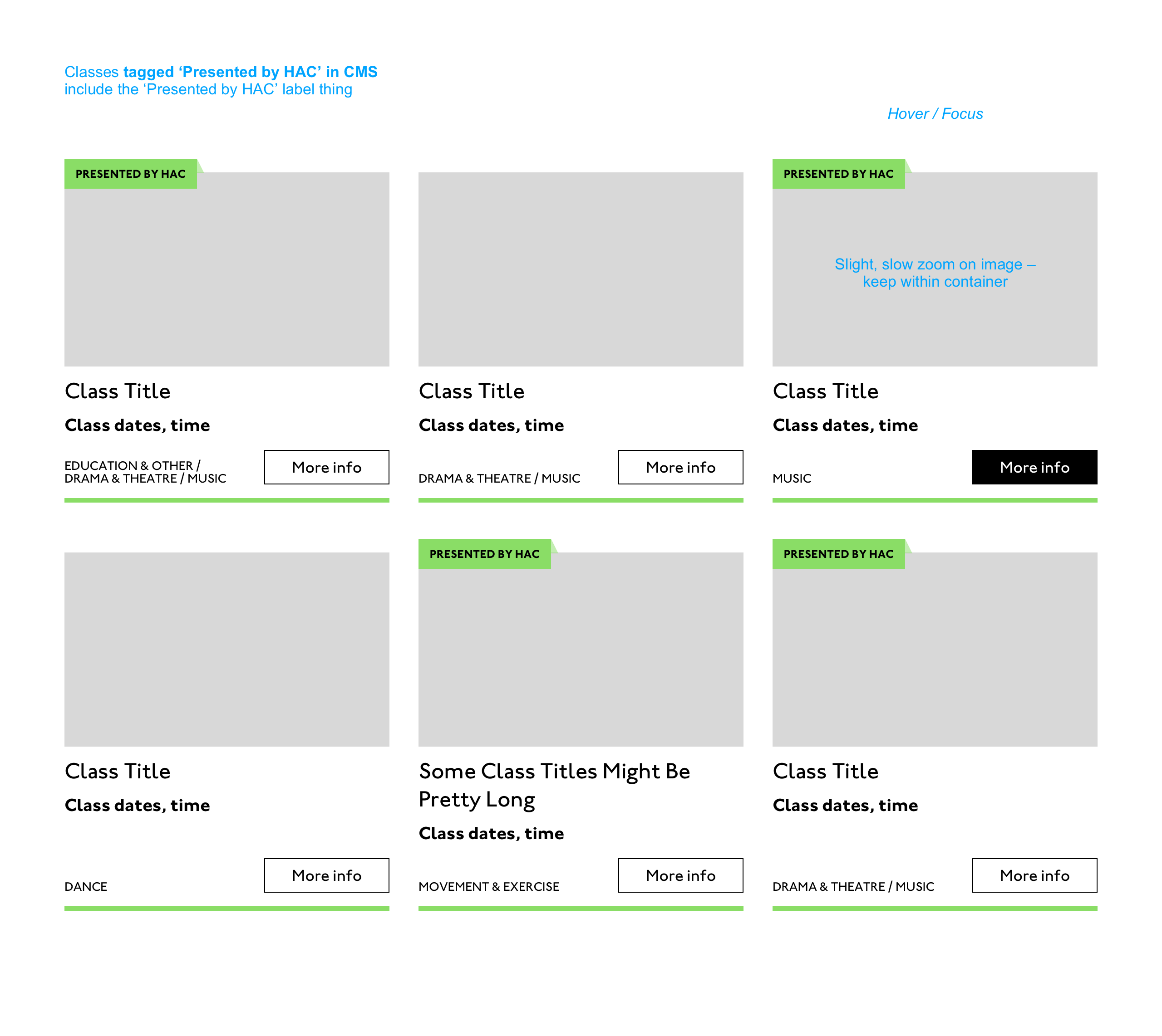
What an ace article! Really interesting. (I particularly like that "," "," etc. on cards are read as "Monday," "Tuesday"... smart!) One thing that struck me is that using assistive tech means users get information served to them in a "set" order that we've decided. So, unless there's a filter, someone browsing for dance events, for example, has to sit/tab through a title, badge, dates, and maybe several other categories to find out whether an event's for them or not. Bit tiresome. But that's not something you've got wrong — it's just how the internet works. Something for me to think about in the future. Most of our clients are arts and cultural venues that need to sell tickets for events so I design a lot of event cards. They're one of the very first things I'll work on when designing a site. (Before even settling on a type hierarchy for the rest of the site.) Thinking visually, here's how I'd describe the general conventions of an event card:
Making information visually scannable is a pretty straightforward case of ensuring every information type (e.g. image, title, date, category, link) is sitting in the same place on every card and follows a clear hierarchy. I focus a lot on typography in my work anyway but clearly: titles are styled to be highly prominent; dates are styled the same as each other but are different from titles; categories look different again – so that folks can easily pick-out the information they're interested in from simply scanning the page. I'm composing the card for the user, saying, "Hey, look here's the event's name, this is when it's on — and here's where you go to get your tickets!" The type styles – and particularly the spacing between them – are doing a lot of work, so I will point out here that the spacings are not quite right in the code sample: 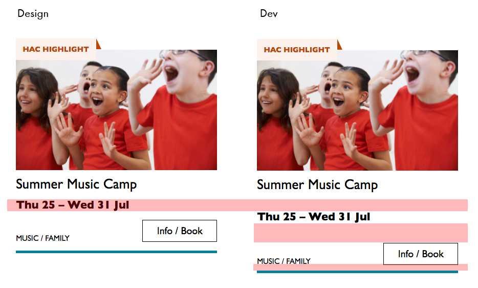
This is important. Users need to be able to scan information quickly as they aren't all looking for the same thing in order to make the decision to go to an event. Too much or too little space between elements can be distracting.
Here, let me tighten that up for you:
See the Pen Perfect! Some people just want a general mooch at what's coming up at their local venue. Others may have seen an advert for a specific show that tickles their fancy, and want to buy tickets. There are people who love music but don't care for theatre who just want a list of gigs; nothing else. And some folks who feel like going out at the weekend but aren't that fussed about what it is they go to. So, I design cards to be easy to scan — because most users aren't at all reading from top to bottom. Despite the conventions I just laid out, cards certainly don't all look the same — or work in the same way — across projects. There is always a tension in web design between making an interface familiar to the user and original to the client. Custom typefaces and color palettes do a lot here, but the other piece of it is through discovery. I spend time reading-up about a client, including who their audience is by reading what they say on review sites and social media, as well as working directly with the client. Listening to people talk through how they work, what feedback they get from their audience/users often uncovers some interesting little nuggets which influence a design. Developers aren't typically involved much in discovery, which is something I'd like to change, but for now, I need to make it super-clear to Sally what's special about this event card for each new project. I write many, many (many) notes on Sketch files, but find they can tend to get lost, so sometimes we have a spreadsheet defining particular functionality.
And soon a data populator instead! :P
See the Pen The post Telling the Story of Graphic Design appeared first on CSS-Tricks. from CSS-Tricks https://css-tricks.com/telling-the-story-of-graphic-design/ Telling the Story of Graphic Design was originally seen on Instant Web Site Tools from https://www.instant-web-site-tools.com/2019/07/26/telling-the-story-of-graphic-design/ Have you ever had a form that needed to accept a short, arbitrary bit of text? Like a name or whatever. That's exactly what But this little story is about something else and applies to any of them. What if the text needs to be arbitrary (like "What's your favorite color?") so people can type in whatever, but you also want to be helpful. Perhaps there are a handful of really popular answers. Wouldn't it be nice if people could just select one? Not a That's what
Here are the basics: See the Pen The use case I was dealing with needed:
I probably wouldn't do a But for that second one, we only had maybe 3-4 unique flags we were dealing with at the time, so a datalist for those made perfect sense. You can type in whatever you want, but this UI helps you select the most common choices. So dang useful. Maybe this could be useful for something like a gender input, where there is a list of options you can choose, but it doesn't enforce you actually choose one of them. Even lesser known than the fact that The post Datalist is for suggesting values without enforcing values appeared first on CSS-Tricks. from CSS-Tricks https://css-tricks.com/datalist-is-for-suggesting-values-without-enforcing-values/ The following blog article Datalist is for suggesting values without enforcing values was initially seen on http://www.instant-web-site-tools/ from https://www.instant-web-site-tools.com/2019/07/26/datalist-is-for-suggesting-values-without-enforcing-values/ You just downloaded an ISO image of your favorite Linux distribution from the official site or a third party site, now what? Create bootable medium and start installing the OS? No, wait. Before start using... The post How To Verify ISO Images In Linux appeared first on OSTechNix. from OSTechNix https://www.ostechnix.com/how-to-verify-iso-images-in-linux/ How To Verify ISO Images In Linux was initially published on http://www.instant-web-site-tools/ from https://www.instant-web-site-tools.com/2019/07/26/how-to-verify-iso-images-in-linux/ Vintage design is all about presentation. You may have spent hours designing a vintage logo or a layout for your client, but in order to fully reap the rewards of your hard work, you’ll want to present it in a vintage mockup template. All of these examples help to showcase the design you’ve poured time and attention into. We’ve featured a huge collection of free and premium vintage mockup sets that match your design aesthetic, all with a classic, retro style!
4 Tips for Vintage DesignMake sure these features are included in your design to give the perfect vintage look to your creations. 1. Pick an Era for Your Vintage DesignWhen talking about vintage design in general, it can refer to any type of design inspired by posters, banners, logos, and other designs from the late 1800s to 1980s. However, they don’t look the same. Especially with the advancements in printing vintage designs kept changing over the years with different styles of fonts, colors, and textures. For example, the 1890s are widely known for Art Nouveau style of designs. And 1930s is known for Art Deco style of designs. Do proper research to learn about the different eras of vintage design and pick a specific theme for your own designs. 2. Find Matching Vintage FontsOf course, your vintage design wouldn’t be perfect without a matching vintage font. These fonts also come in various styles of designs inspired by different eras of vintage designs. You should pick the right font that matches your brand and fits your target audience as well as your overall design. 3. Create a Vintage Color PaletteKeeping a consistent look across your entire design is important. This is common advice for most professional designers, but sadly it’s also something that many designers ignore. Especially when it comes to designing something with a vintage theme, you need to work harder to create an authentic color palette. Unlike other styles such as flat design or material design, when designing with a vintage theme you are limited to a certain number of colors. Find inspiration in different vintage designs to create an appropriate color palette for your own project. 4. Use Vintage Textures and EffectsEven though it wasn’t intended, the textures and halftone colors are also what made vintage designs look quite unique. Adding such textures and effects will also make your modern-vintage designs look more authentic. Thankfully there are many easy-to-use vintage Photoshop actions and filters you can use to instantly apply creative effects to your design to give it a truly vintage look and feel.
Top Pick
50 Hip Vintage Logo Overlay MockupsWith this massive bundle of vintage mockups, you’ll never run out of options to showcase various types of retro, hipster, and vintage designs. The pack includes 50 unique overlay mockups that feature real photo backgrounds. All of the mockups are available in Photoshop PSD format with easily editable smart object layers. Why This Is A Top PickSince the mockups in this pack are made of real vintage-style photos, it will allow you to easily create a more authentic vintage atmosphere to showcase your designs. You’ll also find mockups in various categories for all kinds of logo, badge, and insignia designs. Vintage Poster Mockups Bundle
This bundle of vintage mockups is made specifically for showcasing poster designs. It features 12 unique mockup templates with real photo backgrounds. The template also includes smart objects for easily dragging and dropping your designs into the mockup. Vintage Photography Studio Mockup
Use this creative vintage mockup template to present your photos, posters, flyers, and other designs. The photography-inspired design makes it a great choice for promoting photography studios and businesses as well. Vintage Venetian Sign Mockup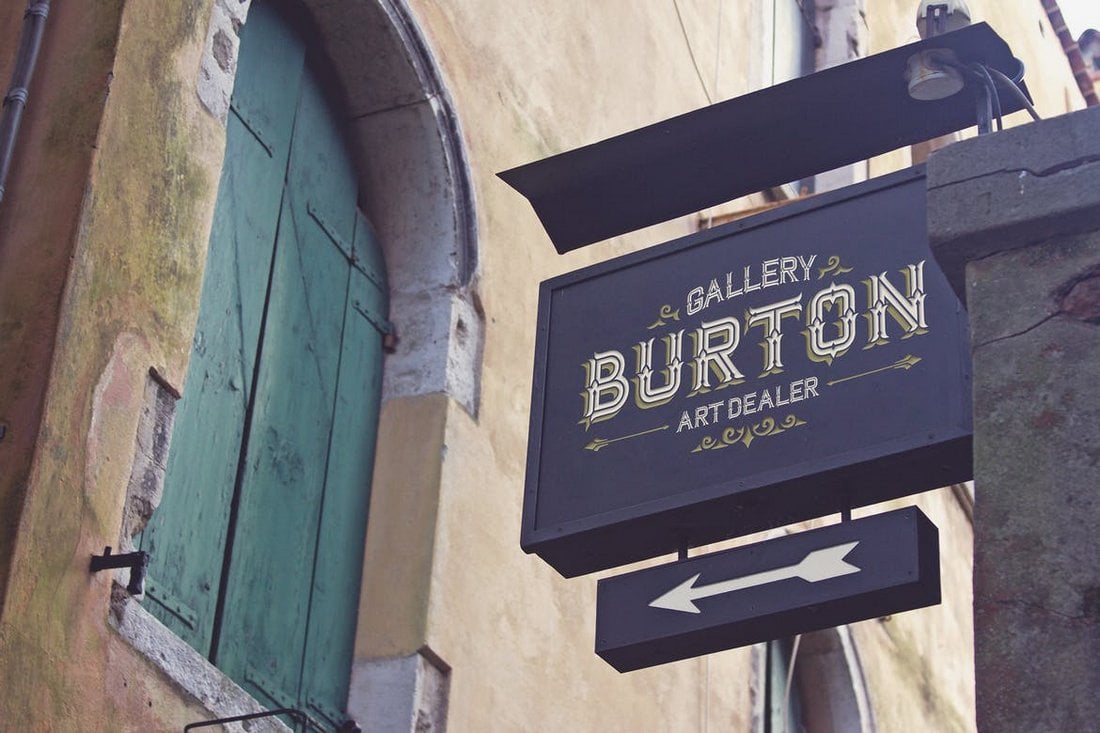
This simple and elegant sign mockup template is perfect for showing off your signage designs. The template features a photorealistic design and fully organized layers for easily editing the mockup. Hand Lettering Logo MockupsIf you’re a designer working on hand lettering logos, this pack of mockups will definitely come in handy. It includes eleven unique logo mockups with real photo backgrounds that allow you to showcase your designs surrounded by vintage and retro elements. Vintage Stationery Mockups
This is a pack of very unique and original mockups that includes 9 realistic stationary mockup templates features vintage objects and backgrounds. The mockups can be used to both present your designs to clients and showcase your work on websites as well. 16 Free Vintage Mockup Templates
This is a bundle of 16 unique mockup templates featuring vintage backgrounds. It includes templates for showcasing logos, badges, websites, posters, and much more. All of the mockups are free to use. Free Home Vintage Mockup Scene
An elegant home interior mockup scene you can use to present all kinds of vintage designs from posters to flyers, photos, logos, and more. This template is available in a high-resolution PSD file. Alternative Logo Mockups Vol.01A pack of logo mockups that features realistic fabric based designs and backgrounds. The bundle includes 6 different mockups with changeable backgrounds and fully organized layers. Indie Vintage Poster Mockups
This pack of vintage poster mockups can be used to present and showcase your movie posters, event posters, party posters, and more. It includes 10 different mockup templates featuring a vintage feel. Vintage Photorealistic Label Logo MockupsProduct labels with vintage designs are a popular trend these days. You can use these label and logo mockups to present your designs to clients. The pack includes 8 mockups and 5 cardboard textures. Cracked Vintage Logo MockupsThis pack of logo mockups comes with 10 different mockup templates featuring vintage cracked wood and canvas based designs. You can use them to showcase logos, badges, and signage as well. Craft Beer Package & Branding Mockups
Working on a beer label or a branding design? Then grab this mockup pack to create a unique presentation. This pack features 10 mockup templates, including 8 branding mockups, 3 types of bottles, 6 backgrounds, and 2 material textures. T-Shirt Packaging Mock-ups
This is a pack of mockup templates you can use to show off your T-shirt packaging designs. It comes with 10 different mockups including 4 types of packaging, all of which feature vintage and retro designs. Free Open Book Mockup Template
This free mockup template is perfect for creative artists and illustrators for showcasing their artworks and designs. The template features a realistic design and it’s easily editable. Free Vintage Craft Mockups
This is a bundle of 2 creative paper bag and gift wrapping mockups. You can use them to showcase background designs as well as logo designs. 3D Vintage Poster Mockups
A bundle of 3D generated vintage mockups for presenting your poster designs. It includes 7 different mockup templates with easily editable smart objects and automatic reflection. 15 Vintage Overlay Textures Mockups
Another pack of vintage logo overlay mockups featuring a realistic weathered effect. It’s perfect for presenting a retro logo or a badge design. 16 Men’s Apparel Mockups
Working on a hipster style T-Shirt design with a retro look? Then get this bundle of mockups to show off your design in 16 different layouts and settings. Wood & Bone – Promotional Mockups
This is pack of mixed mockups that includes several different types of templates for showcasing logos, badges, lettering, fonts, and much more. You can also use them to design website header images as well. The bundle contains 88 mockup templates. Free Vintage Identity Scene Mockup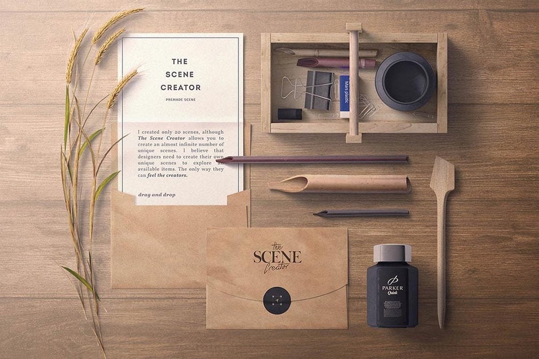
A stylish vintage branding identity scene mockup for showing off all the design elements of a brand in one place. This free mockup includes 10 isolated items. Free Vintage Label Tag Mockup
If you have a vintage label design to present to your clients, use this free mockup to make your design look realistic. This free mockup is available in PSD format with smart objects. Barber & Cosmetics Branding Mock-Up
If you’re looking for branding mockups for a barber shop, a salon, or any other cosmetics related business, this pack of mockup templates is just the thing you need. It comes with 11 PSD files containing 50 different item mockups and 4 pre-made scenes. Kustom Kulture Rusted Photos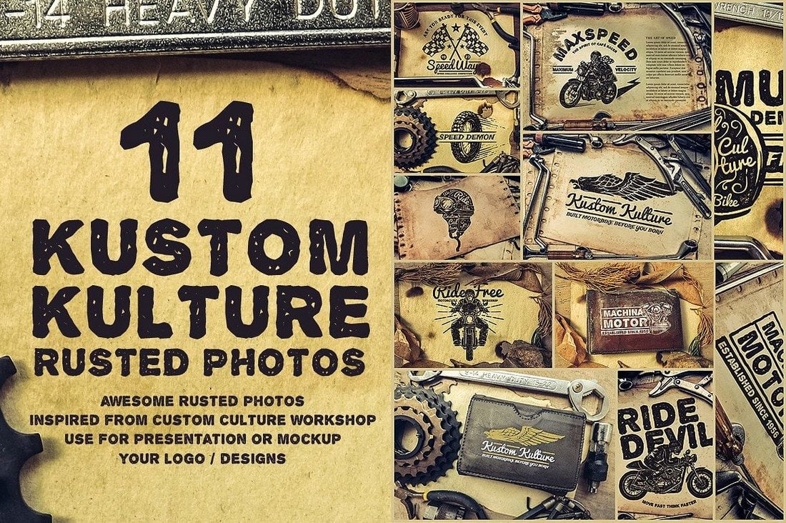
This is a bundle of photos you can use to create your own unique mockups. This pack comes with 11 unique photos with a vintage rusted look. 45 Retro Mockups Bundle
Yet another massive bundle full of retro and vintage mockups. This pack contains 45 mockup templates of garage doors, shop fronts, signage, vintage trains, weathered textures, and much more. You’ll also get each mockup template in 3 different sizes as well. Wine & Restaurant Mock-Ups Set
If you’re working on a restaurant or wine related designs, this bundle of mockups will offer you wine bottle, wine glass, vintage signage, and several other mockup templates for showcasing your designs. 8 Aged Mockups Bundle
A set of very feminine mockups bundle for presenting your card, invitation, fonts, stationery, and many types of designs. The pack includes 8 unique mockup templates featuring real photos. Photorealistic Logo & Insignia MockUpsThis high-quality logo and insignia mockup template bundle is perfect for giving your designs a true vintage and perhaps a royal look. It comes with 6 different PSD mockups. Rusty Vintage Tin Sign Templates
Tin signs used to be a popular trend back in the early 1900s. This mockup template will help you give your modern logo and signage designs that same old look. Mini Design Mockups
This is a big bundle of mini mockups with a vintage design. It includes 120 items for showcasing your logo, font, badge, and many other types of designs in a creative way. Organic Photos Mockups
The organic and homemade style photo mockups in this bundle are perfect for presenting your logo and badge designs in a natural way. The bundle includes 14 photos. Ultimate Vintage Scene Generator
This bundle comes with over 100 vintage elements you can use to create your own unique vintage scenes for designing your own retro and hipster mockups, website header images, backgrounds, and much more. Vintage Mock-Up Scene Generator
If you’re looking to design a beautiful vintage-style scene for your next presentation, this mockup pack will come in handy. This mockup scene generator comes with over 100 items for crafting your own unique scenes for showcasing your designs. Vintage Restaurant Mock-up
This is a brand identity mock up bundle that includes 17 items. It’s specifically designed for restaurants, but it can also be used for designing graphics and scenes for a blog or a website header, letterheads, and business cards, as well. 10 Hipster Mockups Pack
Mixed with a bit of hipster style, these vintage presentation mockups are perfect for logos, product presentations, landing pages, website headers, and much more. It includes 2 scenes with 5 shots, all in editable PSD files. Styled Stock Photo, Frame Mockup
This stylish frame mockup is for displaying your artworks, prints, and photos on your website or on an online store when selling your products. It’s available as a single PSD file in 2400 x 1600 pixel resolution. 100 Signs & Facades Mockups
This massive bundle includes 50 signs mockups and 50 facades mockups, which you can use for your design presentations or even testing out your logo and signage designs before sending them to print. Tins Packaging Mock Up
A set of photo-realistic gold, silver, and metal cans mockups for showcasing your logos, packaging, labels, and badge designs. You can easily change their backgrounds and even change the colors as well. 12 Vintage Logo Mock-upsA set of 12 logo mockups that will allow you to present your designs with a more aged and a classical look. Each mockup in this set has been hand-crafted to include realistic cracks, distress and age. 12 Vintage Hero Images
This collection of high-resolution vintage hero images are designed for web design projects, but they can also be used for your logo and badge design presentations as well. The pack includes 12 hero images using different objects and backgrounds and 12 unprocessed images as well. T-shirt Mockup
The vintage setting of these mockups makes it ideal for showcasing your old-school T-shirt designs with logos and badges. All mockups in this pack are fully layered and easily editable. 4 Loft Mockups
A set of 3d rendered vintage mockups surrounded by vintage electric lamps. Perfect for showcasing your photos, products, and to be used in your presentations. Tabloid Size Newspaper Mockups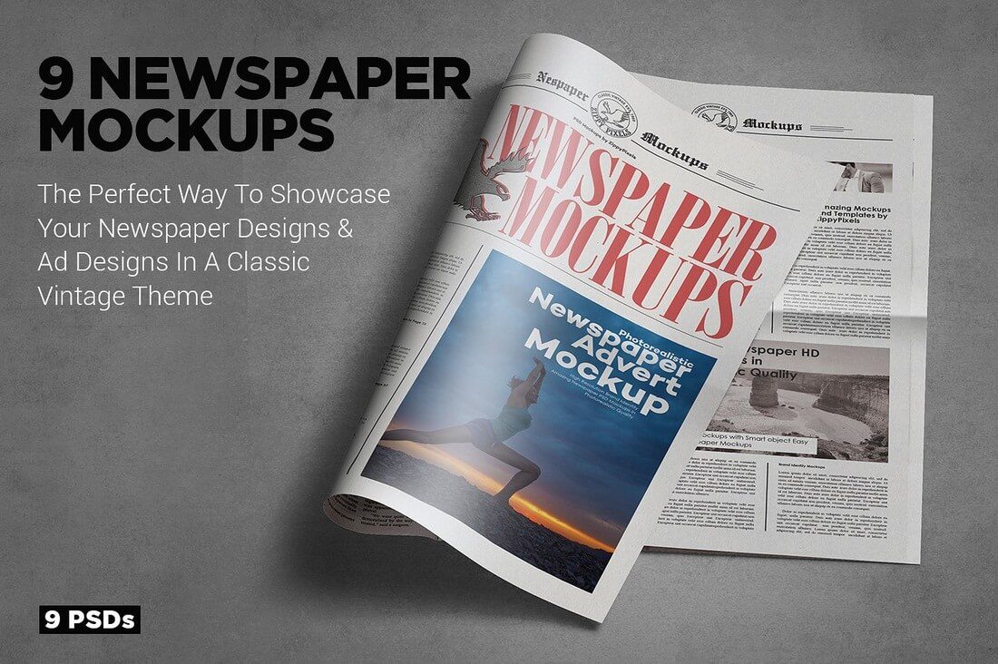 A set of 9 vintage tabloid newspaper mockups for your vintage logo designs, badges, and even for showcasing advertisement designs. 110 Vintage Mockups MEGA Bundle
This is a mega bundle full of vintage mockups, including 50 art equipment mockups, 30 old photo mockups, 30 old video mockups, and more. from Design Shack https://designshack.net/articles/graphics/40-stunning-vintage-mockup-packs-graphics/ 40+ Stunning Vintage Mockup Packs & Graphics See more on: https://www.instant-web-site-tools/ from https://www.instant-web-site-tools.com/2019/07/26/40-stunning-vintage-mockup-packs-graphics/
My sister used to accomplish controlling my focus by sternly, but calmly, telling me to “Get back to your schoolwork” anywhere from fifteen to forty times in a single day. But your users aren’t going to put on some music and “buckle down” to finish browsing your website, they need to be drawn in. The Call to Action—that “Buy” button, for example—needs to look good. 1. ContrastThe first and easiest way to catch the eye is to use contrast. By “contrast”, I mean that the important elements of a design need to stand out from the rest in a meaningful way. See what I did there? Now, there are several kinds of contrast to discuss:
Most of these are fairly self explanatory, but let’s go over them. Light/DarkLight things stand out from dark things, and vice versa. Pretty simple, right? Well… that depends. If most of your site is pretty bright, then making your Call to Action big and dark (or at least a bit darker than everything else) makes sense.
However, there are lots of designs out there where high light/dark contrast is a feature of the entire layout, and that contrast is used to give everything a sense of structure. In that case, you’ll need to use another kind of contrast to direct people’s focus. ColorOkay this one is self explanatory. A splash of color, or even just a different color, is enough to make things stand out. In this example, color is used to cut through a lot of typographical noise.
SizeMake the important buttons bigger than other buttons. Make your headline text bigger than other text. Size contrast can not only make things stand out, but also help to establish hierarchy in the page.
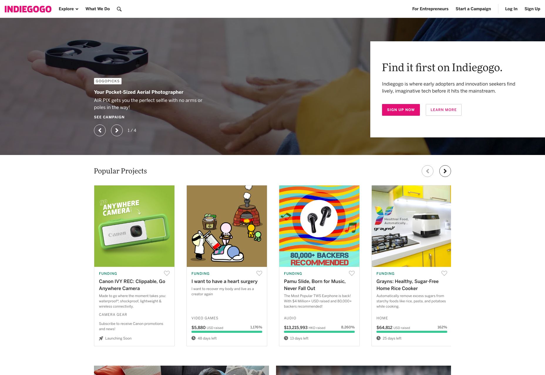
StyleA difference in style can be illustrated by something as simple as the bold text joke I made earlier. But to look at a more UI-focused example, let’s talk about “Ghost buttons”. Ghost buttons are buttons with an outline, but no background color, and they’re often used in combination with regular buttons, like on the home page of IndieGoGo:
I bet you can tell which button they really want you to click on. The stylistic contrast makes this clear. 2. ImagesWhether we’re talking about photography, illustration, painting, or 3D graphics, images grab eyeballs. You can redirect anyone’s attention easily enough with a picture. The only real exception to this would be pictures that are surrounded by other pictures. You can use images as the objects of focus on their own, of course, but you can also use them to draw the eye to other things, such as text or buttons placed on top of them. You didn’t think those were just pretty backgrounds, did you? That may have been how things started, but everything is a lot more calculated these days. If you really want to go all out, place your call to action in such a way that it looks like the picture is pointing to it. This is what your manager would call “synergy”, and it tends to work, despite sounding so very corporate.
3. AnimationAnd if you think we like pictures, let me tell you about moving pictures. No but seriously, if there’s nothing more interesting going on in a room, my eyes will inexorably be drawn to any TV that’s been left on, no matter what’s playing. It could be sports, daytime talk shows, or even a soap opera, and I’ll have trouble looking away. Most of us would. Motion just catches the eye that way. It started out as a survival reflex, and now we just have to know if Brian will ever regain his memory and marry Patricia, or if she’ll remain forever trapped by his evil twin Drake. Use that reflex to your advantage, by incorporating some light animation into things like buttons, helpful tooltips, and any text you really want people to read first.
4. ConventionLastly, take advantage of your user’s default behavior patterns. As web users, most of us have been trained to look for navigation near the top, Calls to Action right under that, and more CTAs at the bottom. Putting important bits of information and functionality where people expect to find them is a perfectly valid strategy. Also keep in mind whether you’re designing for people who read right-to-left, or left-to-right. English speakers, for the most part, will look at the left side of their screen first, for example. While there is something to be said for breaking the mold, never underestimate the power of simple yet deeply-ingrained habits.
5. Use Emphasis SparinglyWhen everything is bold, bold text just tends to blur together, rather than burning important information into the user’s brain. When there are many pictures on a page, and you’re not running a photography portfolio, users may just get distracted. And don’t get me started on the overuse of animation. When everything’s moving, how do you expect them to read any of your text that’s more than a sentence long? To really draw and focus your user’s attention on one or two things, you need to eliminate, or at least deemphasize things that might compete for their attention. Compete with other sites, not your own content. from Webdesigner Depot https://www.webdesignerdepot.com/2019/07/5-tips-for-controlling-focus/ 5 Tips for Controlling Focus was initially published on The Instant Web Site Tools Blog from https://www.instant-web-site-tools.com/2019/07/26/5-tips-for-controlling-focus/ |
 Each of the design trends we are spotting this month have to deal with over-the-top techniques. It’s interesting because these big effects don’t always pop on the radar of what’s trending, but these concepts almost begged to be featured with a large number of projects showcasing these design elements.
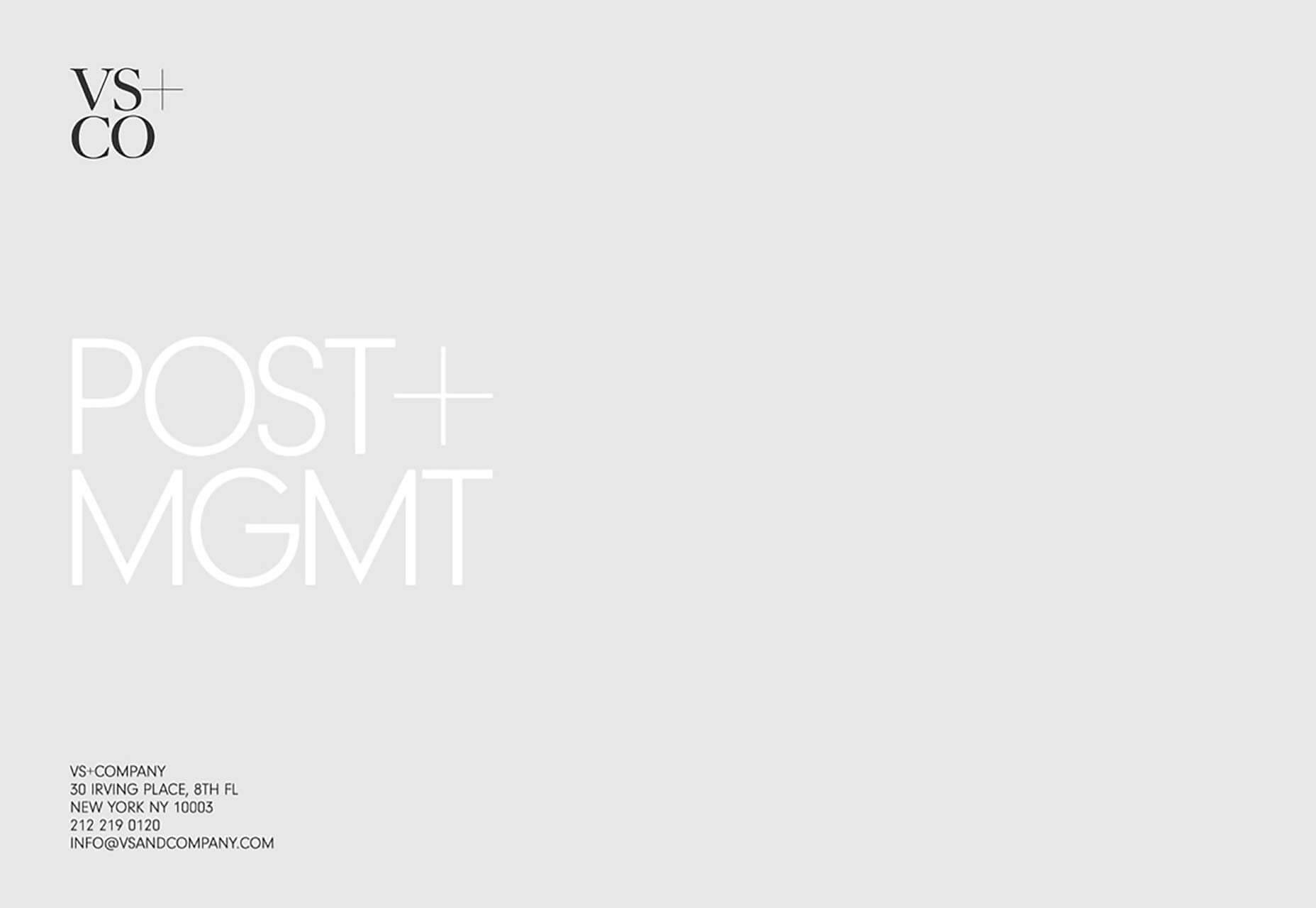
 Every week users submit a lot of interesting stuff on our sister site Webdesigner News, highlighting great content from around the web that can be of interest to web designers.

 You’re going to have build your site in such a way that the eye is naturally drawn from one step to the next.
 RSS Feed
